
Site Navigation Experience
Role: UX Designer | Company: Microsoft
The Challenge
When working on Microsoft’s HoloLens website, we noticed a critical issue with the global navigation. Two primary user groups, customers purchasing the device and developers building applications, were landing on the site but struggling to find where they needed to go. The site didn’t clearly differentiate between these paths, creating confusion and friction.
The Approach
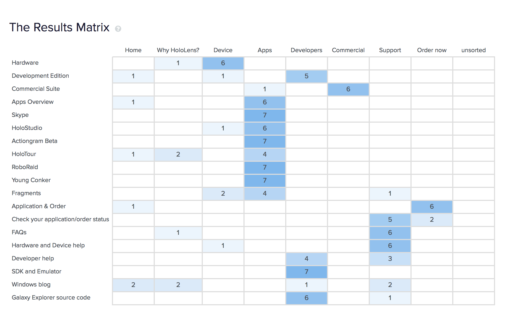
To understand how users perceived the navigation, I conducted a card sorting exercise with both customers and internal stakeholders. This activity provided insights into how people naturally grouped content and what they expected to find under each navigation label.
The Solution
From the findings, we redesigned the global navigation to:
Clearly distinguish entry points for customers and developers.
Reduce ambiguity in menu labels.
Align navigation with users’ mental models.
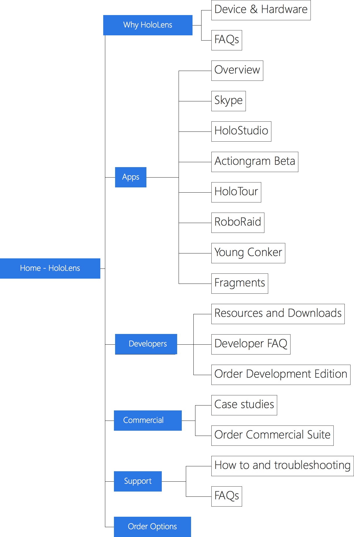
The Outcome
The updated navigation gave both user groups a clear path to their goals, improving efficiency and reducing drop-off from initial landing pages. Developers could easily access technical resources, while customers had a direct route to product details and purchase options.
The Takeaway
This project reminded me that navigation should be shaped by how users think, not how we assume they do. The card sorting exercise showed me that what seems logical to a designer or stakeholder isn’t always how users actually think about navigation.